How to Create a 1930s Style Interior
- By Alicia Newman
- Interior Design Ideas
- views
The main interior look of the 1930s could be achieved using one of two distinct styles that were extremely popular during this period.
Modernist interiors were somewhat austere in appearance and featured a range of simple, streamline shapes and little to no ornamentation or artwork. Mock Tudor and Georgian styles of furniture were often found side by side in a mix and match style of historic designs while decor was very neutral and stark in appearance.
The Art Deco interior style is probably one of the most recognisable design periods of this era. Striking red, black and silver colour schemes and exotic animal imagery and eastern styles would sit happily beside Tudor furniture and modern abstract chairs to create a clashing yet complimentary array of designs and styles.
Modernist colour schemes usually feature a subtle colour scheme such as pale green (eau de nil) and dusky blue, beige, cream and mocha and walls were most often painted as opposed to wallpapered. Art deco interiors embraced a more exotic and eye-catching colour palette using glamorous and dramatic colours such as black and silver with hints of deep crimson, purple or blue. Wallpaper was heavy and textural in appearance with curved arch and shell shaped designs and metallic highlights for added visual impact.
Lino flooring became hugely popular in the 1930s and replaced more traditional wooden and tiled floors in the majority of homes. The appeal of linoleum flooring was that it was cheap, easy to lay and came in a range of colours that could be closely matched to specific styles and decors. A stippled or mottled pattern was a favourite in both modernist and art deco interiors as well as faux tile effects in kitchens and bathroom areas.
The 1930s saw the invention of the ‘three-piece suite’ that created a centralised area of social interaction instead of the typical 1920s layout of individual chairs and scattered seating areas that could be completely distinct in style, pattern and colour. Each item in the three-piece suite was of a matching colour and was covered with matching materials such as woollen velvet in plain colour selections or simple cotton featuring abstract and geometric designs. Occasional chairs were still a popular feature, in libraries or office areas with modernist tubular steel designs and classic leather chairs, such as the famous ‘egg’ chair by Arne Jacobsen creating a balance of traditional and contemporary.
Lighting was mass produced during this period from classically industrial materials that were relatively cheap and readily available. Frosted glass, opaque designs and chrome were partnered to create a chic and simplistic style of lighting that was elegant and refined. Modernist lamp shades often featured simple orbs or tubular designs that were hung with matching chrome spheres and droplets for a contemporary or even ‘futuristic look’. Art deco designs were more glamorous and flamboyant with frosted glass edged with black metalwork or coloured glass and intricate chrome carvings. Wall sconces were hugely popular in Art Deco interiors and featured elegant fan or shell shaped designs and carved and etched glass for an eye-catching feature in an alcove or feature wall.
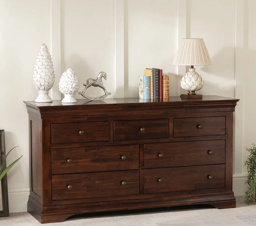
The solid oak furniture of previous eras had become extremely expensive to produce and quite unaffordable for the majority of everyday people, so during the 1930s a solution was found in creating cost effective veneered furniture. Cheap plywood could be used as a base that was covered in a sheet of oak or mahogany to give the visual appearance of luxury without the price tag. Popular furniture designers of the time were Emile Gallé, Alvar Aalto and George Nelson who crafted a range of sideboards, chests, seats and cabinets that showcased traditional materials alongside modern styles (a prominent theme in the interiors of the period). His famous ‘Pretzel’ chair is a perfect example of how classic materials were used to sculpt fluid and sculptural shapes that were far removed from more historic furniture items and designs.
Modernist homes followed a very simple rule when it came to accessories ‘less is less’ surfaces, tables and cabinets were left as unadorned as possible with sometimes even essential items being hidden out of sight where possible. This created the sleek and austere appearance of this interior trend. Art Deco homes were entirely the opposite; glassware, pottery and Bakelite telephones and radios were displayed on sideboards and cabinets to create areas of visual colour and texture. Works by famous ceramic and glass designers such as Lalique, Susie Cooper and Clarice cliff would have been arranged on mantelpieces and showcased in glass fronted display cabinets so they could be appreciated even when not in use. Vintage perfume bottles were displayed on dressing tables in all women’s bedrooms providing a practical and glamorous focal point that reflected the love of Hollywood film star luxury.
For more ideas on creating an authentic 1930s look in your home interior then head over to Pinterest and take a look at our latest board - Pinterest - 1930s Interiors

